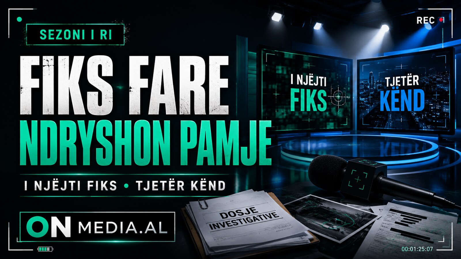
“Fiks Fare” is returning with a new look. Top Channel has released the season promo, showing the investigative programme with a more minimalist visual identity built around dark, green and blue tones.
The redesign is accompanied by the slogan “The same Fiks, a different angle”. The wording points to a refreshed presentation, while the broadcaster continues to frame the format around its reporters working in the field.
The change affects the logo and the programme's overall graphic presentation. No confirmed change to the investigative mission of the format has been announced.
The promo does not yet reveal every detail about the season's content, full team or editorial additions. What has been made public is the new identity and the slogan introducing the programme's next television chapter.
SOURCE: Top Channel, public “Fiks Fare” promo — https://www.instagram.com/reel/B7GqSwLlUA2/